 Hiking
 Login
Login More
More EN
EN Premium
Our hiking platform offers a heatmap that allows Premium users to discover the most popular hiking routes in each region. This tool is available through our website and app, and helps you easily plan the best hikes.
NodeMapp.com is the starting point for hundreds of thousands of hikers every year. Every day, thousands of hikes are created, downloaded, and followed through our website and app. This data provides us with valuable insights into the most popular hiking routes. We are happy to share this information with our users via a heatmap: a map that clearly shows which routes are the most popular in each region. This makes it even easier to plan the best hiking routes in new areas.
How to use the heatmap?
The heatmap is available to all our Premium users. You can activate it in the route planner on our website and in our app. Below, we explain step by step how to activate and interpret the heatmaps.
Heatmap on our website
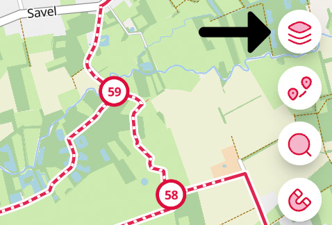
Open our route planner. Open the Layers icon in the top right corner of the route planner:
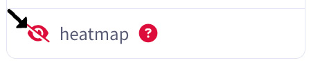
In the menu that appears, make the heatmap visible by clicking on the Visibility button. When the heatmap is visible, you can click on the Color palette to choose a preferred color for the heatmap:

Heatmap in our app
In the app, you can activate the heatmap by opening the menu (3 dots in the top right corner) in the route planner. Select Heatmap. You will then see a popup where you can enable or disable the heatmap and choose your preferred color.
How do I interpret the heatmap?
After activating the heatmap, go to the region where you want to plan a hiking route. The brighter a route appears, the more popular it is among hikers. Also note that each route has a number between 0 and 100. The higher the number, the more popular the route is among hikers. This makes it even easier to identify where the most-used hiking routes are.
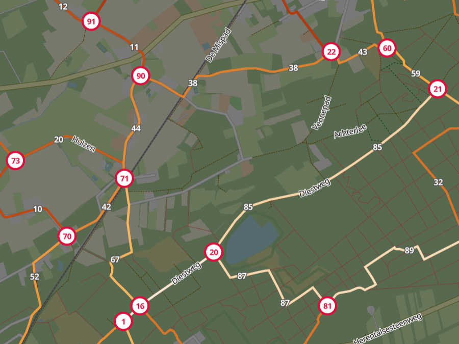
The heatmap is dynamic: when you zoom in on a region, the heatmap automatically calculates the most popular routes within that area and compares them to each other. This means that a score of 100 in region A does not necessarily mean the same as a score of 100 in region B. The scores you see only compare the routes within the area you have zoomed into. For example, if you zoom into a popular tourist region, a route with a score of 100 has probably been used much more by hikers than a route with the same score in a less touristy area. However, this method always helps you find the most-used routes in a specific region.
Are the most popular routes always the most beautiful?
The most popular routes in a region are often the most interesting, but that is not always because they are the most beautiful routes. A higher score certainly increases the chance of a beautiful and pleasant route. However, sometimes a route is popular because it is an important connection between two interesting areas, and it might not be the most scenic option nearby. A route may also have a low score in some situations because it was only recently added to the hiking network. Our heatmap is updated every month. This update is always based on data from the past year. A beautiful route that was added last month has therefore not had much time to prove itself but will certainly light up over time.
The heatmap is a very useful tool to maximize your chances of planning a great hiking route.

 Upgrade to Premium Plus